Martinus bookstore
Driving conversions by focusing on avid readers
Challenge
Martinus, an online bookstore, redesigned their website in 2017. Since then, a lot has changed:
- They began selling e-books, audiobooks, and used books, but the design wasn’t ready for such complexity.
- Mobile traffic surged to over 70%, but the website was primarily designed with a desktop-first approach.
During my routine research, I noticed that this often leads to multiple usability issues.
Research
Throughout the project, I regularly sought feedback from customers using multiple methods:
- Remote user interviews and testing focused on both exploration and validation
- Brief popover surveys to combine qualitative and quantitative data and prioritize
- Customer care feedback to uncover common issues from actual users
Main insights
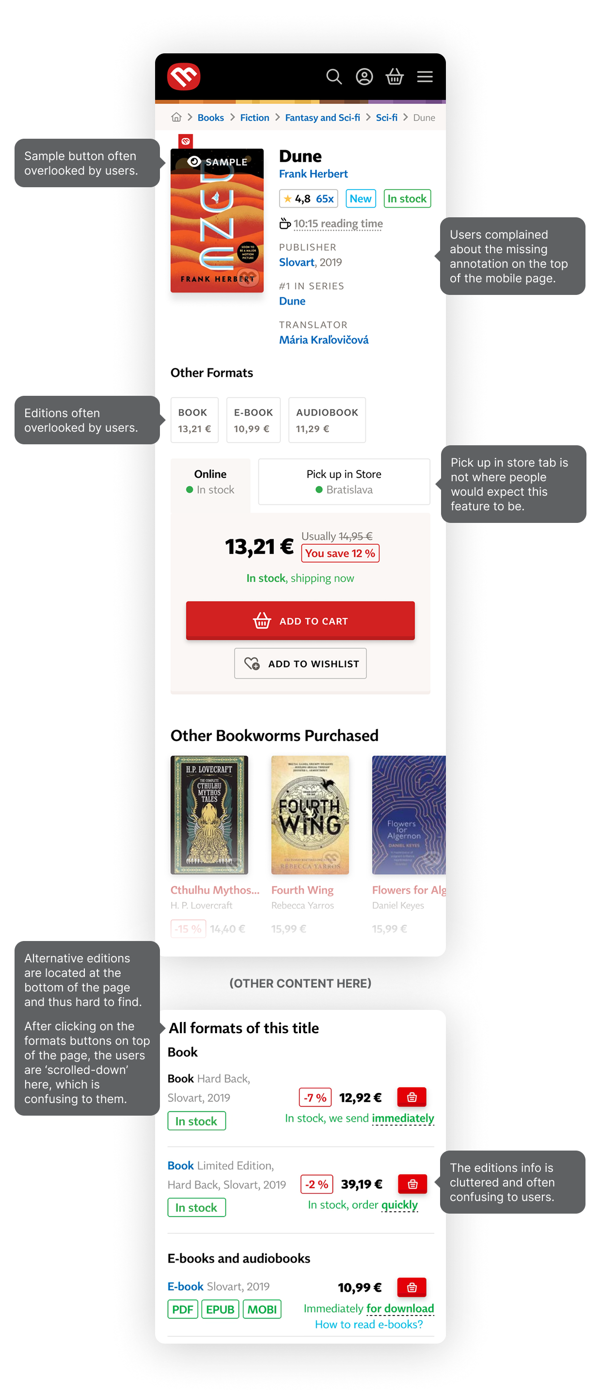
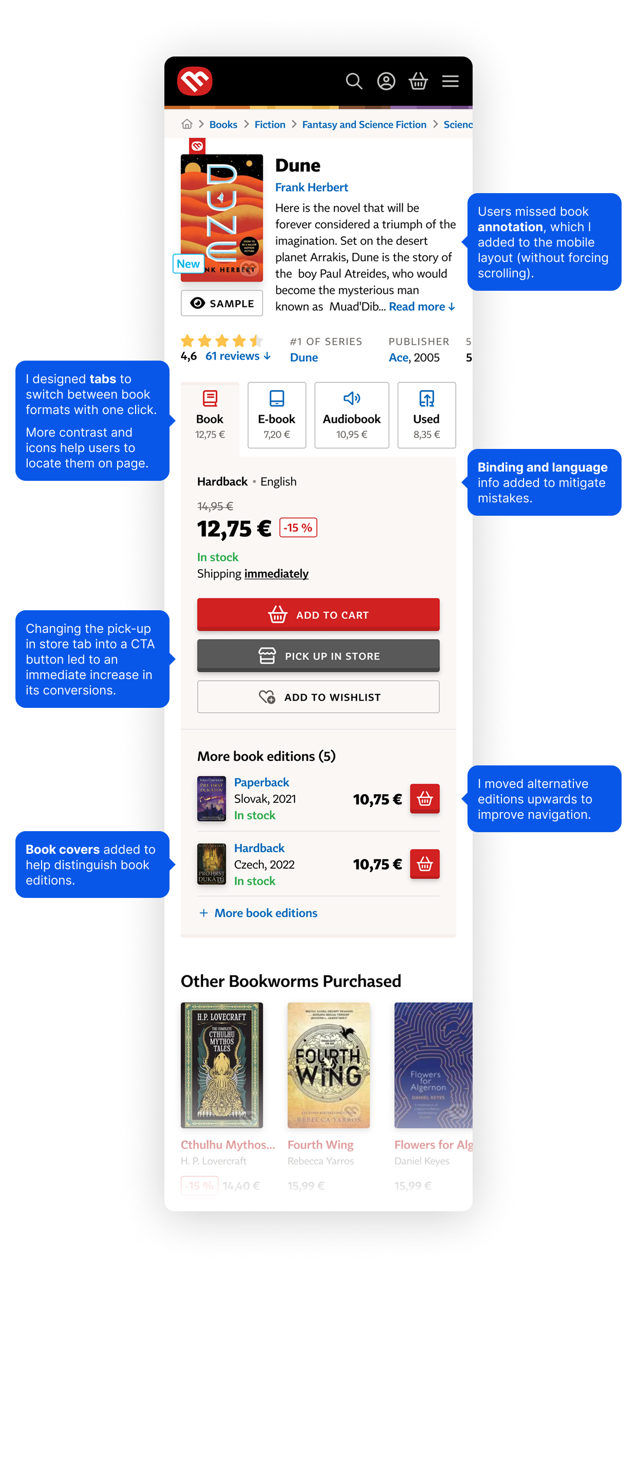
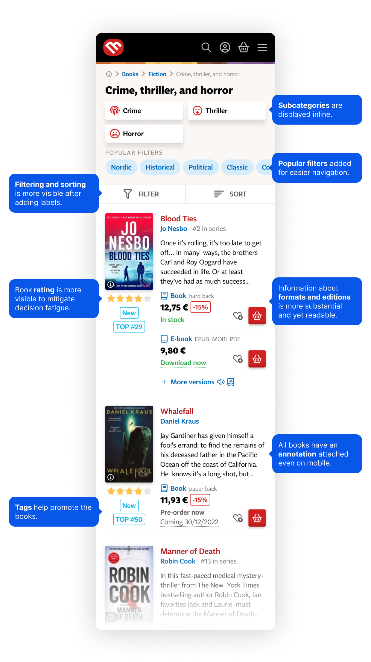
E-books and editions are hard to access
During usability tests, I noticed people struggling to find e-book and audiobook options, as well as alternative editions.
This might be because these options were buried at the bottom of the page.
Customers purchase products they didn’t intend to
By analysing customer care requests, I learned that many customers accidentally bought books with the wrong language or binding.
This might be due to insufficient or unclear information on the page.
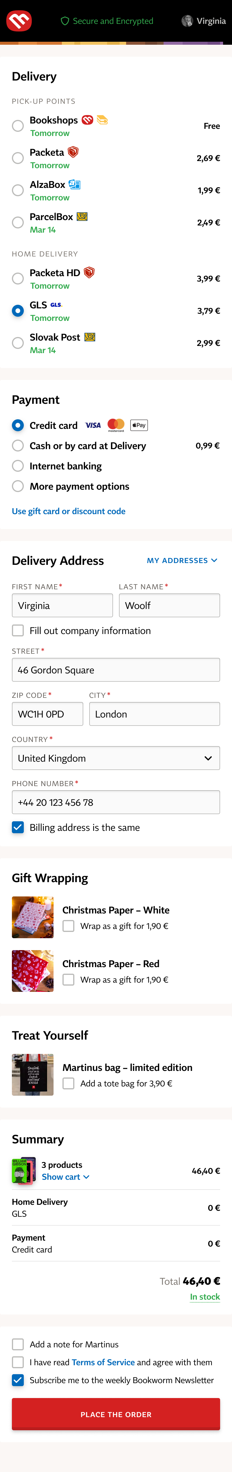
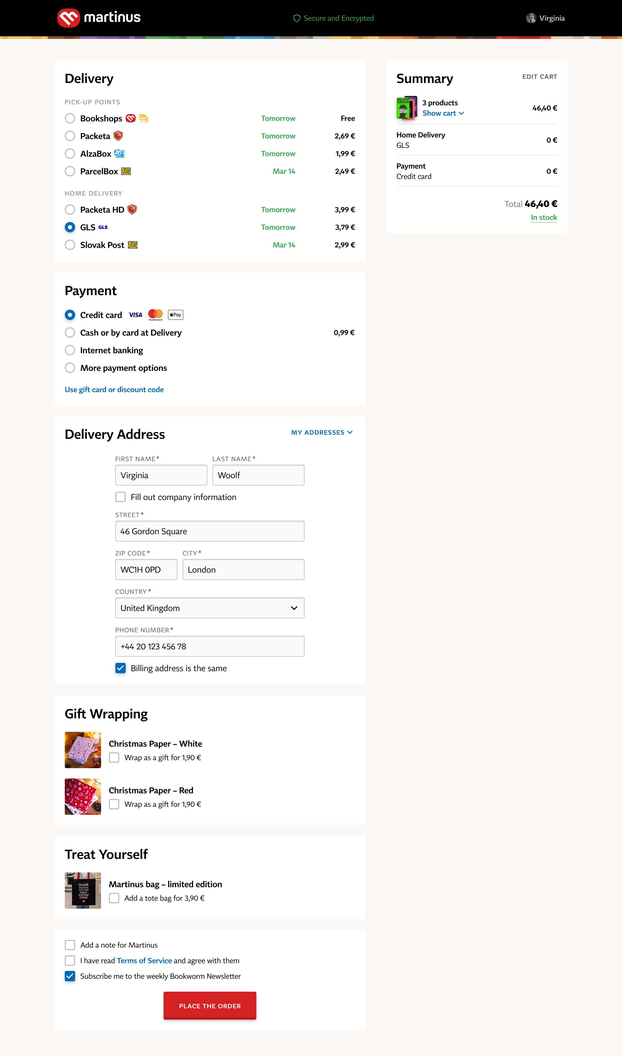
The checkout drop-off is over 60%
Frequent customers complained to me that they found the 6-step checkout process lengthy.
Also, I noticed many research participants struggled to select a pick-up point.
Designing for readers
With the rise of online marketplaces, e-commerce experiences are becoming unified, trying to satisfy everyone. I aspired to create solutions tailored specifically for readers.
Product detail
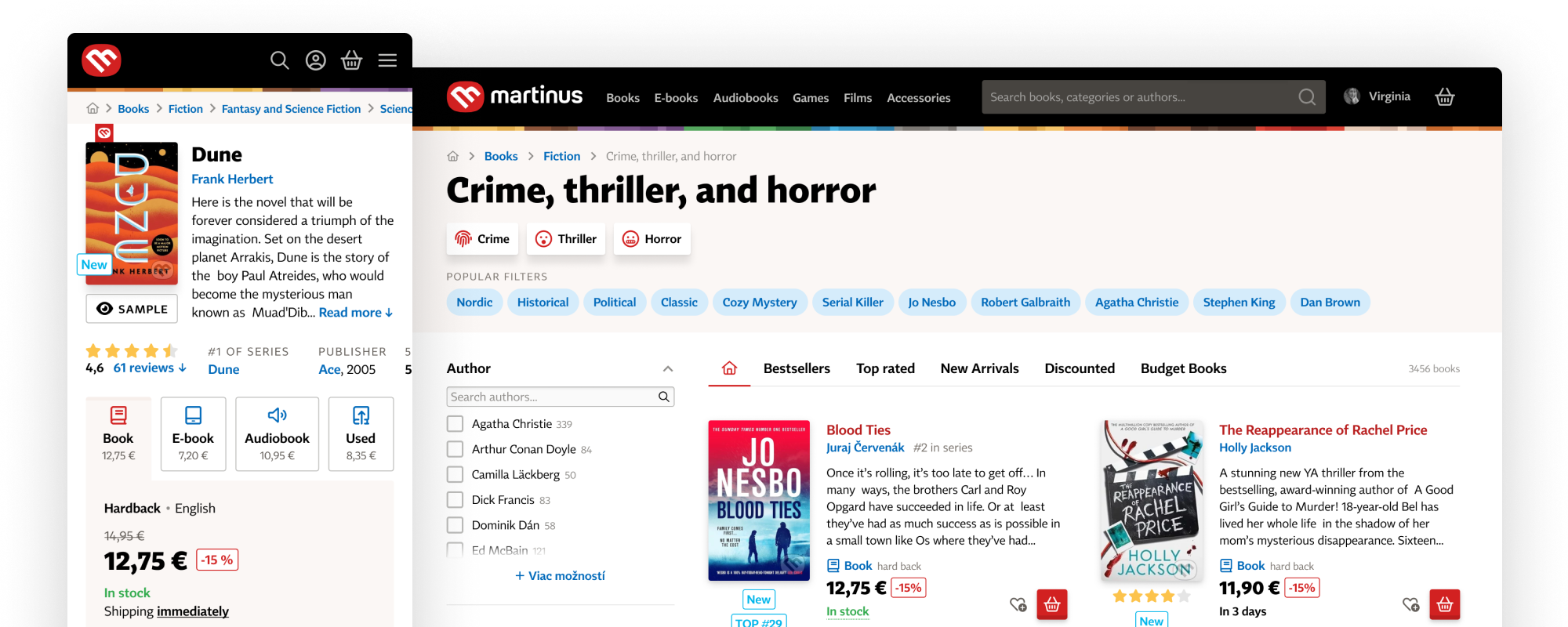
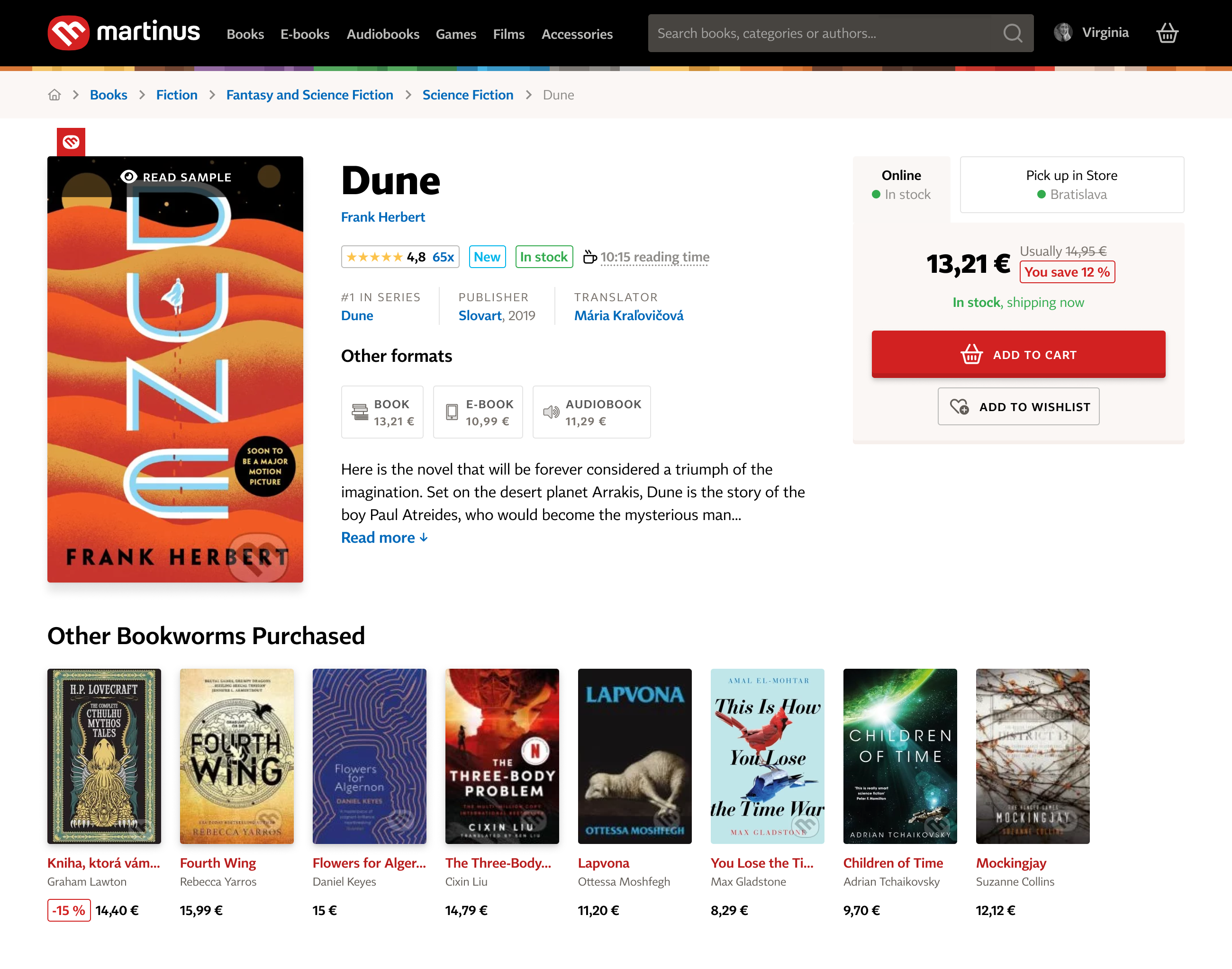
Since it’s the most visited landing page, I began by focusing on the product detail.
Before
After

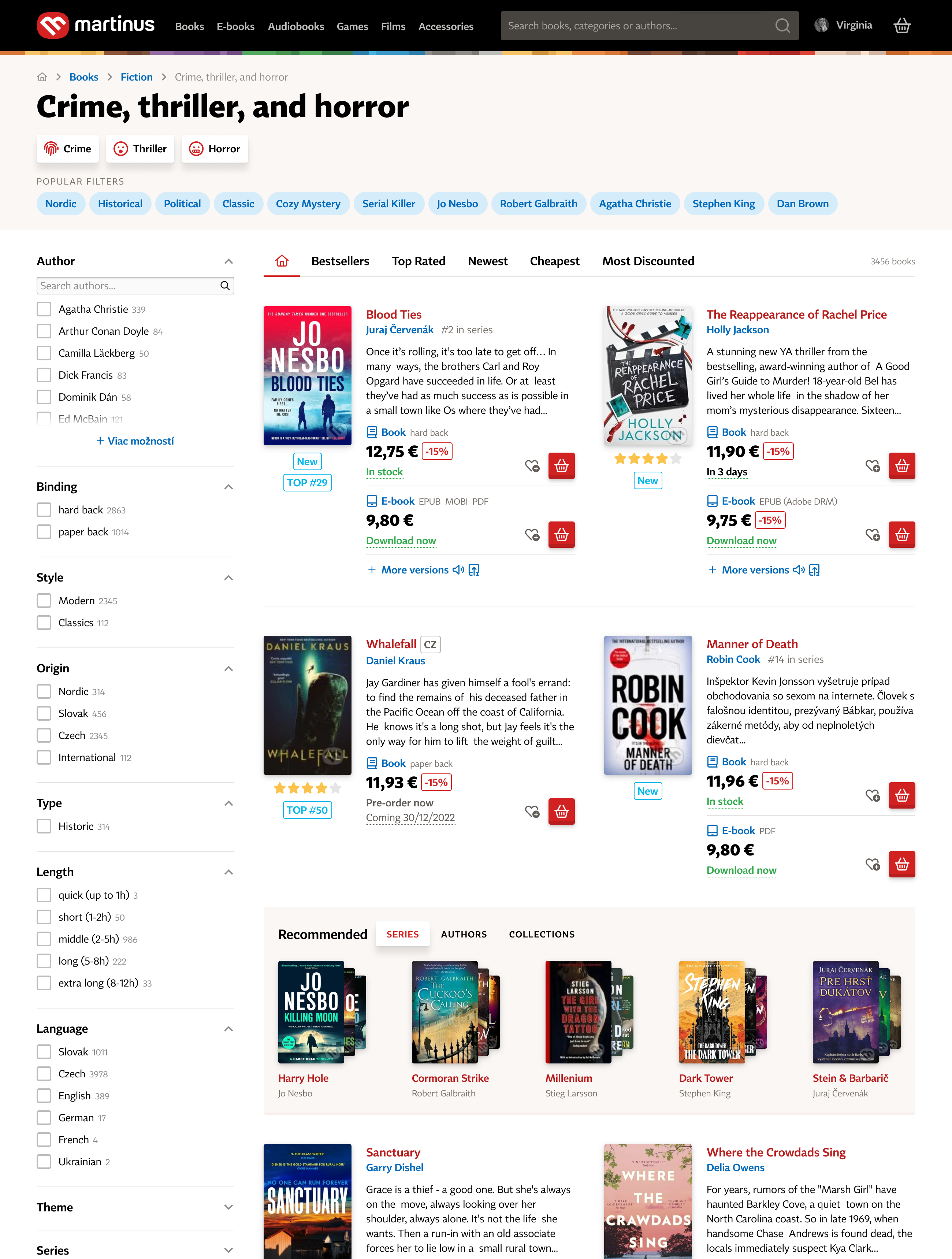
Product category
The category page struggled with similar issues as the product detail.
Before

After
Checkout
I redesigned the 6-step checkout process into a seamless, 1-step experience.

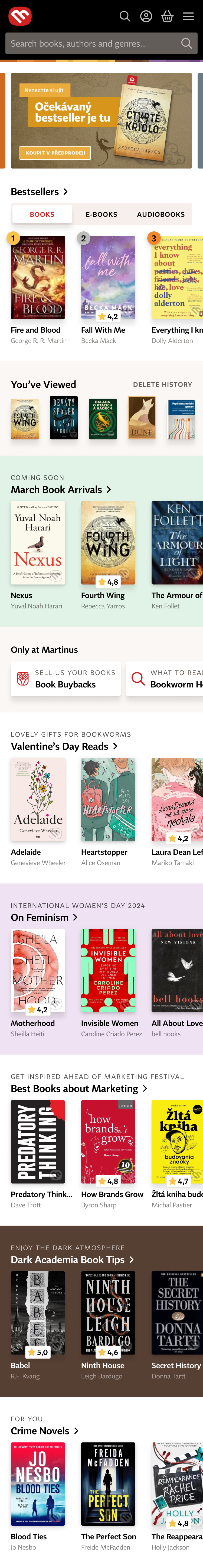
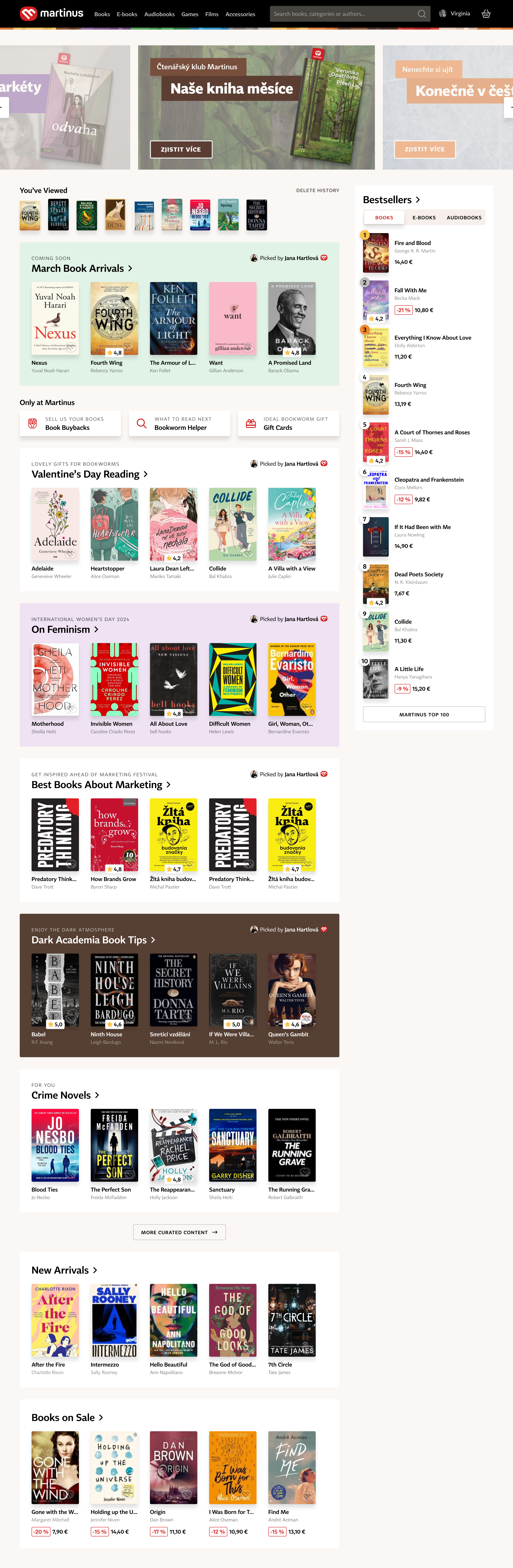
Homepage
The homepage features curated book recommendations, personalised content, and promo.
Impact
After several rounds of usability tests, multiple ideas were implemented and resulted in key metrics improvement.
Significantly higher
Conversion rate
After A/B testing several partial releases – especially on mobile
Significantly higher
Engagement
Customers viewing more products and categories
Decrease in
Customer complaints
Customer Care reported a decrease in accidental purchases
Fewer bugs and
Faster web loading
Thanks to simpler DOM achieved by mobile-first approach
Personal learnings
-
Advocating for change
I learned that to turn my ideas into reality, I must take initiative instead of waiting for PMs or management. Genuine ownership engages others and drives interest in the issues I address. -
Handling long-term projects
This ongoing project taught me to adapt to constantly changing conditions and priorities, helping me feel comfortable in an unpredictable environment.